

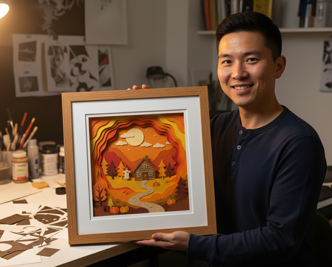
Mat Border Size: Complete Guide to Widths, Reveals & Multi-Mat Looks
Mat borders are the quiet hero of custom framing. Get them right and the art feels intentional; get them wrong and even expensive mouldings look accidental. This guide explains how to think in measurements and visual weight, not Pinterest trends alone.
Anatomy: window, reveal, and borders
- Mat borders are the visible mat showing around the art.
- The window is the cut opening. It is smaller than the image when the mat overlaps the art to hold it in place.
- A reveal is the sliver of art (or underlying mat) you intentionally show at the window edge—for example, a 1/8″ accent between a top mat and bottom mat in a double mat.
If you are new to those terms, read our measuring guide first, then return here for proportions.
Single mat: the classic “even” border
For many photographs, equal borders on the left, right, and top with a slightly wider bottom feel balanced. Why? The human eye anchors low; a touch more paper below the image keeps the cluster from feeling top-heavy.
Typical starting points for desktop-sized portraits:
- 1.5–2″ borders each side on small photos (8×10 and under) when stepping up to an 11×14 or 16×20 outer size.
- 2–3″ borders for medium pieces where you want a gallery look without going monumental.
These are starting ranges, not laws—thin borders can look editorial; ultra-wide borders look museum.
Weighted bottoms and “title space”
Prints with signatures, edition numbers, or date lines often need extra bottom mat so ink is not crowding the frame rabbet. A common approach is adding 1/4″ to 1″ more on the bottom than the sides (sometimes more for tall vertical pieces).
Test in the designer
When you preview mouldings, watch how slim metal profiles expose more mat and wider wood profiles consume wall space. Switch profiles and re-check border proportions before you finalize.
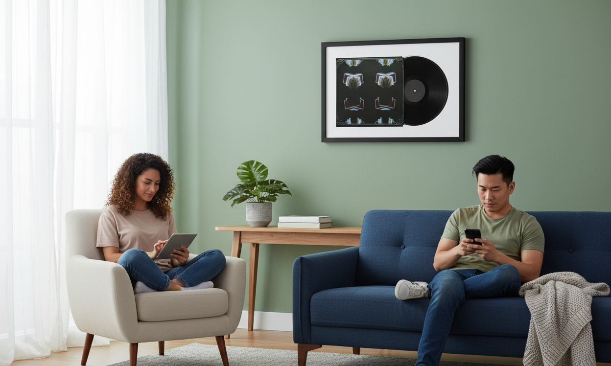
Double mats and reveals
A double mat uses a bottom color and a narrower top mat, with a small reveal of the bottom color at the window. Reveals often land between 1/16″ and 1/4″ depending on the stock thickness and the boldness you want.
Contrast rule of thumb: if the top mat is close to the art’s dominant tone, pick a bottom mat that steps clearly lighter or darker so the reveal reads as a crisp line, not a smudge.
Wide art and panoramic formats
Panoramas punish “formulaic” matting. Equal tall borders on the top and bottom can make the image feel squeezed. Consider:
- Wider side borders with modest top/bottom space for a cinematic strip.
- Floated presentations if the full sheet edge is part of the story (see shadowbox/float articles).
Color temperature vs moulding
Cool-gray mats push contemporary minimal looks; warm whites pair with traditional woods and golds. Highly saturated mats can work for posters but often fight fine art. When unsure, neutral mats + quieter frames keep resale and longevity in mind.
Conservation notes
Mats are not only decorative—they help keep glazing off the surface. Thicker mat stacks and spacers matter when using textured media. If you are combining multiple windows (diptychs), align baselines and maintain consistent gutters between openings so the set reads as one composition.
Putting it together in checkout
You do not need to hand-calculate every reveal if you use a guided flow—what you do need is a clear idea of overall border personality (tight editorial vs airy gallery) and any signature zones that require extra bottom weight.
Build it visually: open the custom frame designer and iterate mat widths alongside moulding profiles until the balance feels right on screen—then confirm measurements against your physical art.
Multi-opening layouts (diptychs and grids)
When one mat carries two or more windows, viewers unconsciously compare gutters (space between openings). Keep gutters even unless asymmetric design is intentional. Baselines for figurative work should line up—nothing says “rush job” like two portraits at different elevations in one mat.
Storytelling order
Western readers scan left-to-right; chronological photo stories should move time forward in that direction unless you are deliberately mirroring for composition.
When to skip the mat (and what replaces it)
Spacers, fillet details, or float techniques can separate art from glazing without a classic mat window. Skipping a mat to “save money” while still needing separation is backwards—either engineer separation or accept risk.
Color science for the skeptical
You do not need a degree—just luminance contrast. Two blues can clash if their values are too close; shift one lighter or darker to restore separation. When mats match wall paint too tightly, frames visually dissolve; a touch more contrast restores object permanence.
Embellishments: V-grooves, fillets, and “fancy but still math”
V-grooves cut a bevel line into the mat face to echo inner window geometry—they add formality without adding color noise. Fillets are slim accent strips at the window edge; they consume a tiny amount of effective opening, so recount overlap rules if you add one late in the process.
If you chase ornament, keep one hero detail—groove or fillet or double mat—not all three competing for attention unless you are intentionally maximalist.
Working with bold art vs quiet art
High-contrast graphic posters tolerate chunkier borders because the image already carries energy. Whisper-soft watercolor prefers more air—crowding the art with skinny mats and loud fillets feels like shouting over a lullaby.
Analog proof trick
Cut blank paper to candidate outer sizes and tape lightly to the wall. Live with the silhouettes for a day—your brain registers proportion better than a screen zoom.
Related guides
About CustomFrameSizes Team
Professional framing experts helping you create the perfect custom frame for any project.